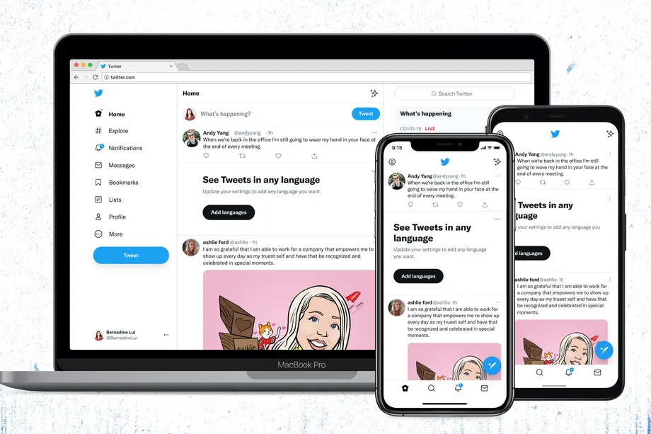
Twitter is now officially rolling out a new font ‘Chirp’ to its app and web feed. This means that the appearance of the app will be slightly different than what it used to be. Furthermore, Twitter has also introduced some changes in its design. Let’s have a look at those changes too.

Twitter via its main account (@Twitter) posted about the font change in a humorous manner. Check out the tweet below to see what we meant.
In their official blog, Twitter said, “Chirp strikes the balance between messy and sharp to amplify the fun and irreverence of a Tweet, but can also carry the weight of seriousness when needed.”
Back in January, Derrit DeRouen, creative director of Twitter said that it was his “personal desire” to make Chirp the new typeface for Twitter.
Chirp, the new font also has a fun Easter Egg in it. People on Twitter can now tweet the Twitter logo by typing [CHIRPBIRDICON] in the tweet compose box. [CHIRPBIRDICON] has “chirp,” “bird,” and “icon” all joined as one word. It is important to note that the word has to be typed in all capitals. Check out the Tweet below to see how the Easter Egg looks.
In addition to the changes in Font. Twitter has also brought changes to its visuals (and design). “We’ve updated our colors to be high contrast and a lot less blue — a change made to draw attention to the photos and videos you create and share. We’re also rolling out new colors soon, giving you a fresh palette.“
Twitter has also cleaned up a lot of “visual clutter.” There are fewer gray backgrounds and unnecessary divider lines. It has also increased space to make text reading easier. Twitter has confirmed that this “is only the start of more visual updates” as it is becoming more centered towards its users and what they have to say!


