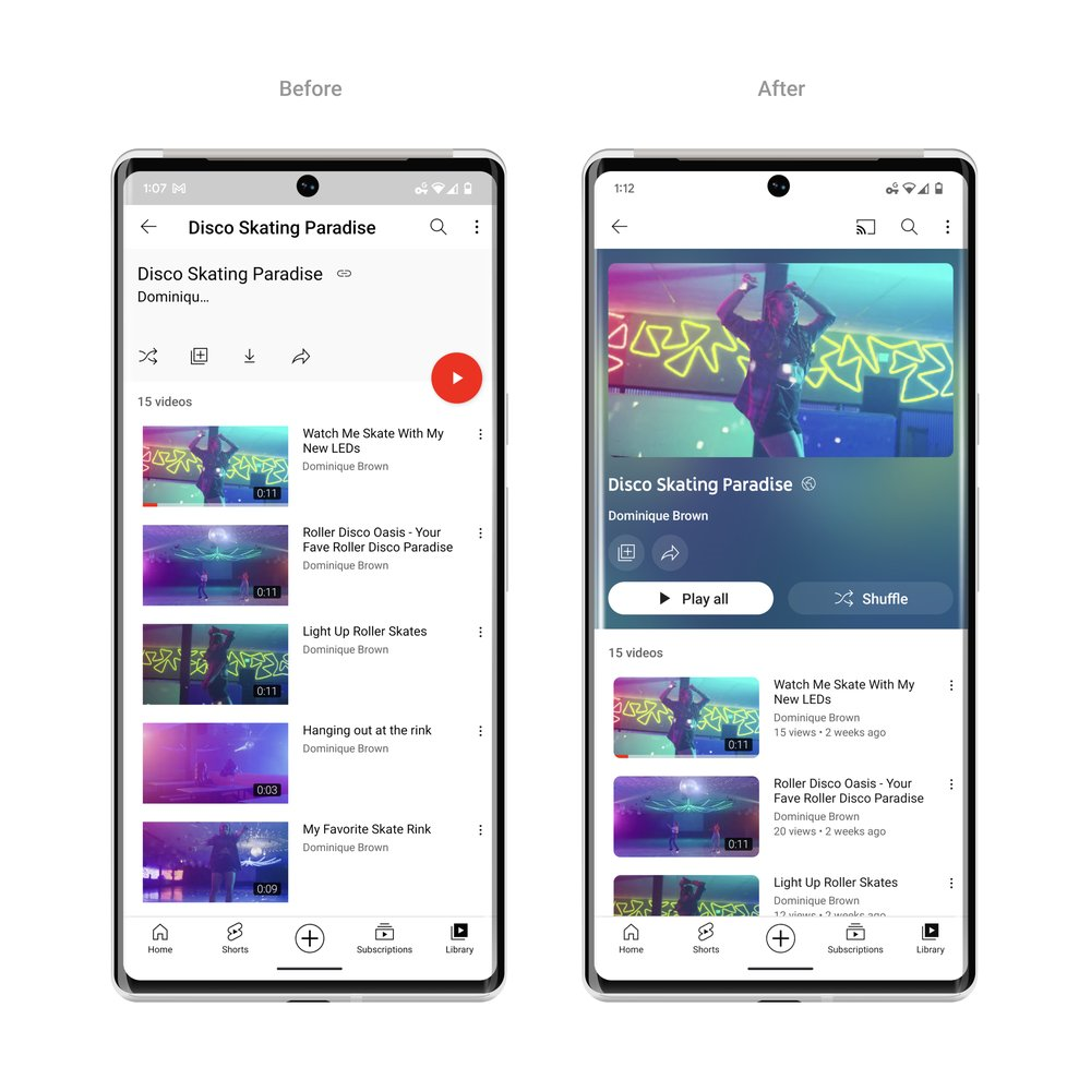
YouTube has an update and here’s how it’s looking. YouTube blog has written about it and announced the new update. “YouTube just celebrated its 17th birthday earlier this year and we wondered if it was time to give it a small makeover. So we gathered input from thousands of viewers around the world and heard there was a desire for a cleaner, more lively design that better represents what we’re all about.”
“Starting today, we are rolling out a new look and features that offer a more modern and immersive viewing experience while also improving how users watch videos. But don’t worry, the same YouTube you know and love is still at our core.”, they added.
A splash of color
They made color a central feature of their development process because they wanted to make apps more vibrant without interfering with users’ routines, such as watching their suggested movies or searching for new material.
After experimenting with various concepts, the ambient mode was born. And it was a relief when the initial design concept received overwhelmingly good feedback from users throughout testing.
The ambient mode uses dynamic color sampling to add a subtle effect so that the app’s background color changes to match the video.

Video playlists will adopt the same color treatment and now show more details about each playlist so viewers can easily jump right in.
It all starts with a video!
They’ve also added changes to the video player!
YouTube links in video descriptions that will change to buttons, and frequent actions such as like, share and download, are now formatted to minimize distraction.
“Now, we’re making the watch page easier on the eyes: YouTube links in video descriptions will change to buttons, and frequent actions such as like, share and download, are now formatted to minimize distractions. The subscribe button is also getting a touch-up: the new shape and high contrast make it really stand out, and while it’s no longer red, it’s easier to find and way more accessible to everyone on both watch pages and channel pages.”, they wrote.
And we’re more than just our looks. After introducing and testing several new product features on youtube.com/new earlier this year, we heard from many of you wondering when we’d make these more broadly available. The wait ends here: we’re launching pinch to zoom and precise seeking to all users starting today.
Also Read: LinkedIn rolls out new “Person” and “Page” link stickers!
With pinch to zoom, you can now easily zoom in and out of a video while on your iOS or Android phone. And when you let go, the video stays zoomed in so you can enjoy the rest of the video in greater detail. Give your fingers a rest!
Precise seeking will help solve problems! Whether you’re on a desktop or your mobile device, simply drag or swipe up while seeking to display a row of thumbnails in the video player and you’ll be able to make fine-tuned adjustments to get to the exact part in each video.
Precise seeking builds on our recent improvements to video navigation that help you quickly find the parts you’re most interested in.
This new update for the streaming application will bring in new looks and interesting adds for the consumers.


