If you could visualise a whole year through one colour, which colour would it be? Taking this abstract thought Pantone follows the annual practice of announcing a “Colour of the Year.” And the colour for the coming year has finally been unveiled: Introducing PANTONE 13-1023 Peach Fuzz. A hue between pink and orange, Peach Fuzz as a colour is soft and inviting and offers “tenderness and communicating a message of caring, community, and collaboration.”
The experts at the Pantone Color Institute trawled through high-fashion runways, interior design trends, pop culture moments, and human psychology to make their pick. PANTONE 13-1023 Peach Fuzz captures the desire to nurture ourselves and others. Known for its colour standards and digital solutions in the design community, Pantone announced the colour aiming to move towards empathy and understanding.
It’s a velvety gentle peach tone with an all-embracing and enriching spirit. “In seeking a hue that echoes our innate yearning for closeness and connection, we chose a color radiant with warmth and modern elegance. A shade that resonates with compassion, offers a tactile embrace, and effortlessly bridges the youthful with the timeless,” said Leatrice Eiseman, Executive Director, Pantone Color Institute.
Also Read: Synopsis Of YouTube Trends In 2023
About The New Shade
Highly suggestive of good taste, PANTONE 13-1023 Peach Fuzz creates a symbiotic relationship between our sense of taste, sight, touch, and scent. At a time of turmoil in many aspects of our lives, the need for empathy and compassion grows ever stronger in the hope of a more peaceful future.
Laurie Pressman, Vice President, Pantone Color Institute said, “The color we selected to be our Pantone Color of the Year 2024 needed to express our desire to want to be close to those we love and the joy we get when allowing ourselves to tune into who we are and just savor a moment of quiet time alone.”
The subtly sensual peach hue does just that and more. Speaking about Peach Fuzz, Eisman said that it is “…more frequently a woman’s color. And yet it has been adapted and gathered into men’s wardrobes and surroundings. I think that speaks to the modernity of the shade.”
The History
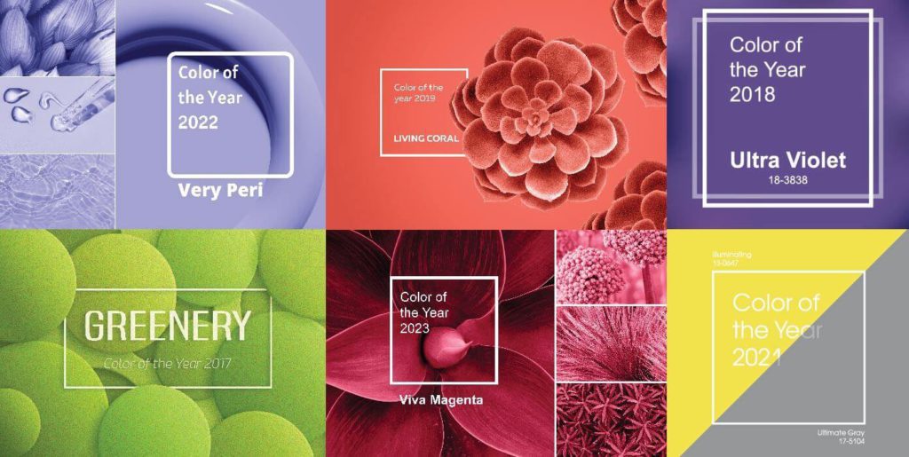
This announcement also commemorates the 25th anniversary of the Pantone Colour of the Year program, which began in 1999 with PANTONE 15-4020 Cerulean Blue. Over the years, the program has evolved into a cultural phenomenon, aiming to reflect and express the “prevailing mood” and attitudes of our global societies through colour. As a giant in the colours industry, Pantone has revealed many statement colours that affect the design world.
When asked how the ritual of “Pantone Color of the Year” began, Laurie said that The Pantone Color Institute originally created this educational program in 1999 to engage the design community and colour enthusiasts around the world in a conversation around colour. “We wanted to draw attention to the relationship between culture and colour — to highlight to our audience how what is taking place in our global culture is expressed and reflected through the language of colour,” she said.
Last year, the institution termed “18-1759 Viva Magenta” as its 2023 Colour of the Year. Representative of brave fearlessness, the colour was inspired by joy. In 2022, a shade that falls under the blue colour family but with violet-red undertones was selected. The colour highlighted the merge between the physical and digital worlds at the time.

Who Picks The Pantone Colour Of The Year?
To arrive at the selection each year, a team of global color experts at the Pantone Color Institute comb the world looking for new color influences. The team members come from a wide range of design, cultural, and geographical backgrounds. The commonality that brings them together is their expertise in colour and design, and their ability to see the world through the lens of colour. They are color anthropologists with an intuitive ability to connect all that is taking place in the world and translate it into the language of color.
This can include the entertainment industry and films in production, traveling art collections and new artists, fashion, all areas of design, aspirational travel destinations, new lifestyles, playstyles, or enjoyable escapes, as well as socio-economic conditions. Influences may also stem from new technologies, materials, textures, and effects that impact color, relevant social media platforms, and even upcoming sporting events that capture worldwide attention.
How Is The Colour Picked?
The colour selection process is a culmination of the macro-level colour trend forecasting and research that the global team involved with the Pantone Color Institute conducts year-round. Everyone on the global team loves all the colours equally. Most of the daily conversations of the global team are rooted in color and design, including material and surface finish.
Conversations relating to the Pantone Color of the Year selection do not take place in one isolated meeting at a specific time of year. It is one long, continuously flowing conversation among a group of color-attuned people who reside in disparate locations, involved in differing areas of design, but always come to a consensus.
“We also consider the color name in our selection process as names immediately conjure up an image and a feeling. We want to make sure that the name of our Pantone Color of the Year resonates and can easily and intuitively convey the message we are looking to send” said Laurie.
Affecting Marketing Trends
Pantone’s Color of the Year can have a significant impact on marketing trends because it is widely recognized as a leading authority on color in the design industry. The selection of a specific color as the “Color of the Year” often sets a trend for that color to be used in various forms of design and marketing, such as fashion, home decor, and packaging. Businesses may incorporate this color into their branding and marketing materials to stay current and appeal to consumers.
In Architecture and Interior Design
PANTONE 13-1023 Peach Fuzz can create warm and welcoming atmospheres. This peach hue is claimed to nurture a sense of tranquility and provide spaces for relaxation and personal growth. Whether on a painting wall, in home décor, or furniture, the color brings a gentle warmth to intimate spaces.
In Hair and Beauty
A contemporary peach with depth and understated lightness, Peach Fuzz 13-1023 creates a reflective finish and a natural rosy glow for the hair. It complements a wide range of skin undertones, enhancing various complexions with its ethereal charm.
A surprisingly versatile shade, it enlivens the skin, adding soft warmth to eyes, lips, and cheeks making all who wear it appear more healthy. Fresh and youthful when paired with earthy browns and dramatic when paired with deep reds and plums, the Pantone Color of the Year 2024 opens the door to a wide assortment of lipstick, blush, skin tone, and contouring options
Nail designs incorporating peach hues express tenderness and are considered romantic, innocent, and sweet.
In Packaging and Multimedia Design
A clean peach tone with a vintage vibe, PANTONE 13-1023 Peach Fuzz reflects the past yet has been refashioned to have a contemporary ambiance, enabling it to seamlessly display its presence in both the physical and digital world.
Seemingly tactile, PANTONE 13-1023 Peach Fuzz welcomes consumers to reach out and touch. Its warm tactility makes it an enticing shade for a variety of products, from food and beverage to cosmetics and accessories. Inspiring thoughts of sweet and delicate tastes and scents, the colour tempts the taste buds.
Pop Culture Appearances
Peach tones have been a regular on the Spring-Summer 2024 runways, particularly in Milan with Italian houses such as Gucci, Jil Sander, and Sportmax leading the way. Hilary Duff wore a peach-hued Dolce & Gabbana gown at the Oscars Vanity Fair Afterparty in March. Shortly after, Uma Thurman attended the Women Making History Awards in a Prada Fall-Winter 2023 gabardine dress in the same color.
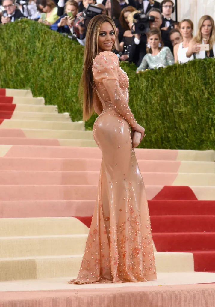
The last time we saw Beyoncé at the Met Gala in 2016, she donned a peach puff-sleeved, embellished latex Givenchy gown which was a key moment for Eisman and the Pantone team. Florence Pugh wore a Spring-Summer 2020 Chloé dress in the shade for the French premiere of “Little Women,” while Zoë Kravitz’s peach Oscar de la Renta column gown that she wore to the 2020 SAG Awards made headlines for its classic, vintage appeal.

Dwayne Johnson rocked in his Oscars 2023 ensemble. His tuxedo jacket from Dolce & Gabbana was the perfect shade of Peach Fuzz, and in an intrinsically tactical satin fabric. And for inspiration on how to further update the tone to modern tastes, take a cue from Rihanna and the peach leather mini dress she wore while heavily pregnant in 2022 at the Off—White runway show in Paris.
A Controversy Spews
The choice of “Peach Fuzz” as Pantone Color of the Year 2024 led to some controversies and backlash on social media. One TikTok creator Erin Raimondi (@erinraii) critiqued the shade, saying that it resembles flesh. Erin added that color is an integral part of communication in this world and the shade Peach Fuzz specifically reflects one particular skin color, which seems quite off-putting.
She said that many designers have also shared a similar thought. Certain people deemed Peach Fuzz an insensitive color choice due to its likeness to Caucasian skin. Many commenters on Erin’s video called out how the colour resembled flesh Crayola crayons that were prevalent during their childhood. Erin said the color predominantly reflects white skin.
Skin. The Pantone Color of the Year for 2024 is basically white people's skin tone.#Fail
— Tony Gill 🇺🇦🌻💪🌊 (@tonygill99) December 8, 2023
“This is extremely concerning and weird” said Erin in her video. She went on to explain ‘Color of the Year’ as something that is a projection of what the year would look like in socio-political and cultural aspects. She further spoke about hoe the color Peach Fuzz will now be everywhere in fashion and interior designs as brands will try to sell people their products in this shade.
She also pointed out that Pantone does reflect on politics as it made two special colors Freedom Blue and Energizing Yellowas Colours of the Year in 2022 for Ukraine. One comment on Pantone’s Instagram post was highlighted in Erin’s video which asked the company why it didn’t choose the watermelon color symbolizing freedom for Palestine during this ongoing brutal war.
On the other hand, one user explained that the company chooses the Color of the Year 24 months prior to the final announcement. Thus, implying they couldn’t select a shade more politically aligned with the ongoing war. A few others also mentioned how Taylor Swift was chosen by Time Magazine as the Person of the Year. They correlated it with Pantone’s Color of the Year 2024 and further doubled down on their claim that Peach Fuzz is a questionable shade.
If 1999 was about embracing the unknown and engaging some blue-sky thinking, Pantone prescribes a quiet retreat inward for 2024. “In 2023, we celebrated coming out of the malaise of the last year,” said Eisman. “We feel that next year, with so much whirling in the atmosphere around us, there will be a need for some quiet, some peace, some respite, and that’s what that Peach Fuzz will be for us.” How do you feel about this?


