Every TV enthusiast is aware of the excellent programming available right now. When it’s freezing outside, you might want to binge-watch Yellowstone episodes or the Golden Globes highlights, as per YouTube and yet we squander too much time flipping through different channels in search of a show to watch. So their team spent a lot of time considering how to improve the experience when developing YouTube TV; in fact, even contemplated doing away with the live guide entirely! But they came to the conclusion that it was a need to accommodate viewers.
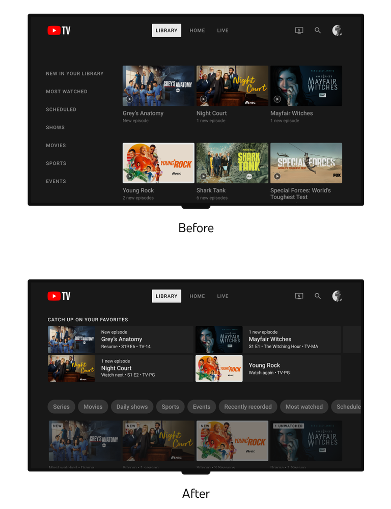
“Today, we are walking you through the latest redesigns of YouTube TV’s Live and Library. Our team’s philosophy is that YouTube TV is ‘TV Made For You’. We’re now starting to roll out updates to the library, which will help you manage your content with improved content filtering and better organizational tools to make your library feel less cluttered. Users should begin seeing this redesign over the next few months. We wanted to share our UX thinking behind these changes and how we kept our members and their viewing experience top of mind during the research and design process.”, wrote the YouTube blog on 18th January 2023.
TV for you
The YouTube team firmly believes that its TV is “TV Made For You,” and this sentiment permeates every aspect of the Live, Library, and Home product experiences. Viewers can use these surfaces to discover what is currently airing, browse recommended shows, and revisit stuff they may have missed.
The team first developed user-focused fundamental ideas that would guide the redesign of these surfaces on YouTube TV before even beginning to sketch out designs:
- Give consumers more flexibility and options so they may watch TV as they want to.
- Recognize various interests and viewing habits.
- Anticipate viewers’ demands for TV material by providing it to them more easily.
To discover and prioritize design decisions, employ user research from in-home interviews, app feedback, surveys, and idea testing. Observations that shaped our strategy include:
When you turn on your TV and discover even more apps and channels than before, decision fatigue is real. Whether it’s joining a live game or viewing what’s currently trending, viewers are searching for simpler methods to get the material that is most relevant to them. They also look for contextual information, such as a show’s synopsis, air date, episode, and major players (such as the cast, crew, or athletes), to help them not only choose what to watch but also determine whether it is worthwhile.
Viewers desire more discretion. However, people with larger libraries have a difficult time locating exactly what to watch. Our subscribers appreciate YouTube TV’s unlimited DVR. Although members have amassed substantial libraries over time, they may no longer be interested in programs that were of interest to them a few years ago. Parents in particular provided us with a critical insight: they frequently thought that their libraries were overflowing with children’s content and desired a means to view their own recordings more clearly. Because there were no methods to arrange their shows, movies, and sports, as their library increased, they became less and less useful.
Each second has value. Viewers want to quickly return to the list of the “most watched” and quickly locate any pertinent programming that is currently airing. It must be simple for them to understand all we want to say about watch advancement, novelty, and relevancy. Additionally, we now know that audiences prefer simple, one-step recordings of broadcasts.
Also Read: 2023 Social Media features that you need to know!

They built a visual hierarchy for the library so users could quickly sort through the variety of newly added information. They also discovered that the library wasn’t the best to view quickly based on user research. By adding filters and a “Catch up on your favorites” shelf, the navigation was made less congested so that users could quickly find the most recent and pertinent content for them.
These adjustments are in line with their overarching goal of providing a pleasurable, user-friendly, and contemporary TV experience. YouTube is concentrating on integrating our concepts across important surfaces (Live, Library) rather than just one big launch, and they are honing in on crucial user experiences (Collecting, Browsing, Watching). With as little disturbance to users as possible, YouTube TV strives to bring clear and up-to-date upgrades to the entire experience.
With improving products by taking a comprehensive, viewer-centric approach and using guiding principles. With Live and Library, they’re just getting started. With new ways to empower people on Home while enhancing browsing and discovering experiences. In order to ensure that TV is tailored to you, they will introduce greater flexibility and engagement during live playback and make it simple to swap between user accounts. Stay tuned for more information!


